I wanted to try out some new plots/ways to visualize data that I have never used before.
The first one was the use of library(gghighlight).
ggplot(allstats, aes(x = Year, y = THREEP., color = Player)) +
  geom_line(size = 1.25) +
  gghighlight(mean(THREEP.) > 40, label_key = Player) + #highlight!
  ylab("Three Points Percentage") +
  ggtitle("Average Three Point Field Goal Percentage, years 2017-2019")  +
  geom_point(size = 3.25) +
  scale_x_continuous(name ="Year",
                 breaks=c(1,2,3)) +
  theme_bw()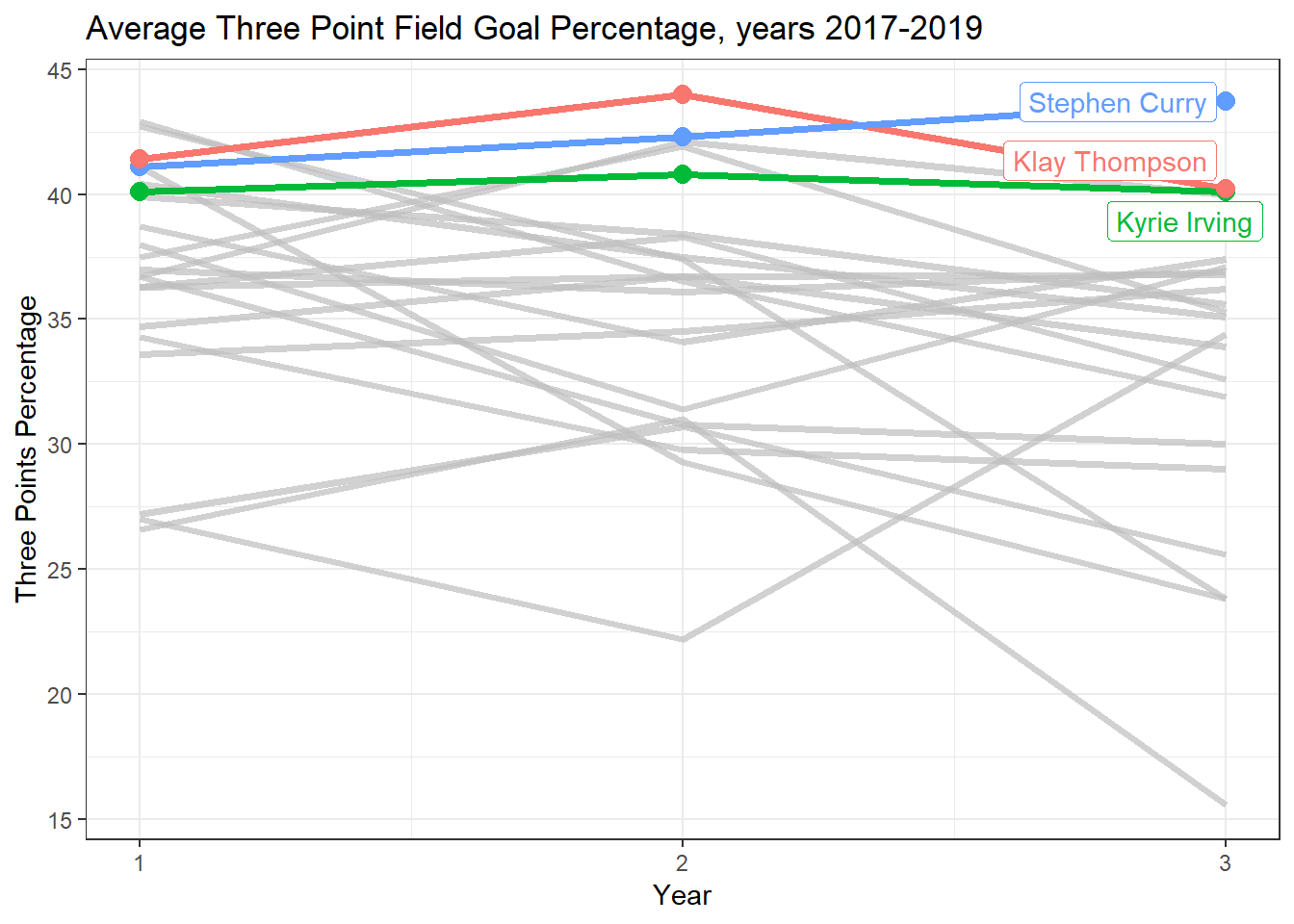
This library lets you highlight lines, points, etc. in your graph using a filter! For the graph above I wanted to see the players who had a mean Three point Percentage greater than 40 over the past three years: gghighlight(mean(THREEP,) > 40, label_key = Player). We can see thatonly three players have 3P% over the past three years, Stephen Curry, Klay Thompson, and Kyrie Irving.
The next plot was the lollipop chart.
ggplot(data = threePA_year, aes(x = Year, y = threePA)) +
  geom_segment(aes(x = Year, xend = Year, y = 0, yend = threePA)) +
  geom_point(size = 4, color = "#00BFC4") +
  theme_bw() +
  ggtitle("Average Three Point Attempts per Game, 1996-2019") +
  ylab("Three Point Attempts")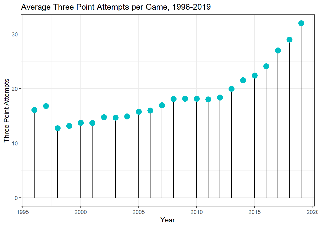
Lollipop charts, essentially another version of a bar chart, consist of a clever use of geom_point() as the data point and geom_segment() as the “bars”. Lollipop charts serve the same purpose as bar charts, but, in my opinion, they do look more aesthetically appealing, and sometimes that’s all that matters!
This chart shows how the average three point attempts per game has changed over the course of ~20 years (1996-2019).
The last visualization I tried was with the use of library(gganimate).
ggplot(data = statsAllYears, aes(x = THREEPA, y = THREEPP, color = Team)) +
  transition_time(Year) +
  geom_point() +
  theme_bw() +
  guides(color = FALSE) +
  labs(title = "3PA vs 3P%, Year: {frame_time}") +
  xlab("Three Point FG Attemps (Per Game)") +
  ylab("Three Points FG Percentage (Per Game)")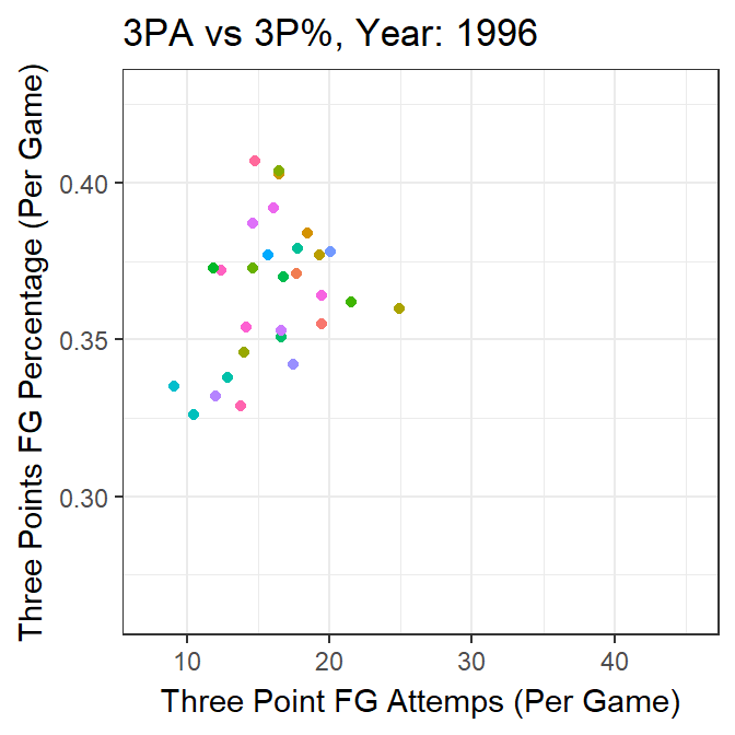
gganimate let’s you visualize how your data changes through another categorical variable. In this specific case I wanted to see the relationship between Three Point Percantage and Three Point Attempts through the years 1995-2019, which adding the code transition_time(Year) does.